CUMEDIAE: Where the inspiration for the logo came from?
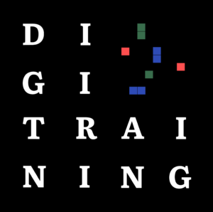
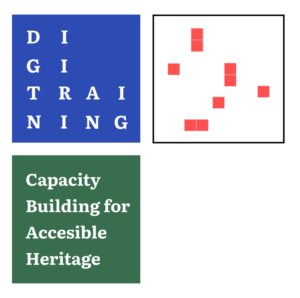
Amanda: DigiTraining is a project that brings together two concepts that we usually separate: analog and digital. In the context of DigiTraining project, analog is going to make its way to digital through the capacity building program, which supports the development of digital skills for small and midsize museums. This way, heritage will be brought closer to everyone highlighting the importance of conservation and accessibility to culture. This duality was the starting point to develop the whole visual identity
CUMEDIAE: How was this duality reflected in the logo?
Amanda: One of the first elements to represent it was the use of two typographies, whose difference was the existence or non-existence of serif. This is what gives a font a classical aura or the complete opposite: fresh and minimal.


However, the high presence of technology in this project brought to the table the use of pixels: the rawest way of thinking about digital, lit bulbs and computers. In this sense, we are coming back to mention the importance of cultural heritage, our roots; and representing it with these pixels that also reminisce about arcade, retro gaming and the beginning of a digital era. This is how the decision of using a “pixeled” visual element was made, honoring this idea.
![]()
![]()
CUMEDIAE: And what about the choice of the colors?
Amanda: The choice of using RGB as the color palette came naturally: it intensifies one of the sides of the equation representing the three main colors used to create digital images. This final decision closed the circle with the main elements of a visual identity whose objective is to be versatile, consistent and easy to recognize. Through this process we got to abstract the parts of something that we notice as a whole, learning to identify along the way the roots and history of a concept that has developed into what we know today.
